Apple Unveils Tree-filled Regent Street store by Foster + Partners
Original article is written by Alice Morby on 13 October 2016, all copyrights are reserved by Alice Morby
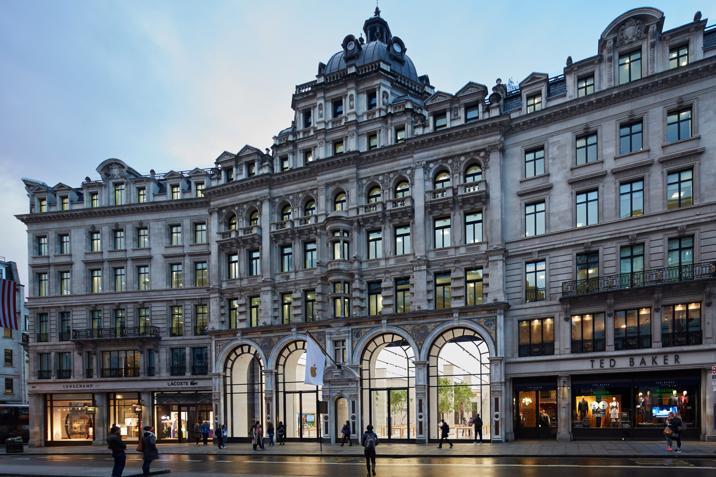
Apple‘s central London store has reopened following a major renovation by Foster + Partners that incorporates the tech giant’s new approach to retail.
The Regent Street store – Apple’s first outpost in Europe when it opened in 2004 – was closed for a lengthy period while it was revamped according to the company’s new interior design format.
As seen in the San Francisco Apple Store, also designed by British architecture firm Foster + Partners, the new approach puts more emphasis on community and entertainment.
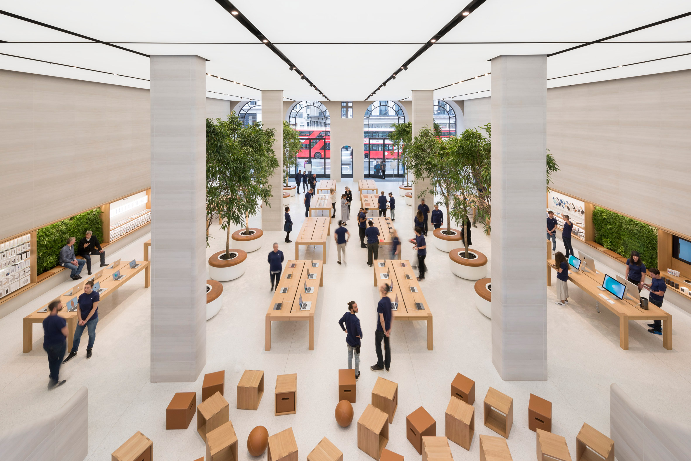
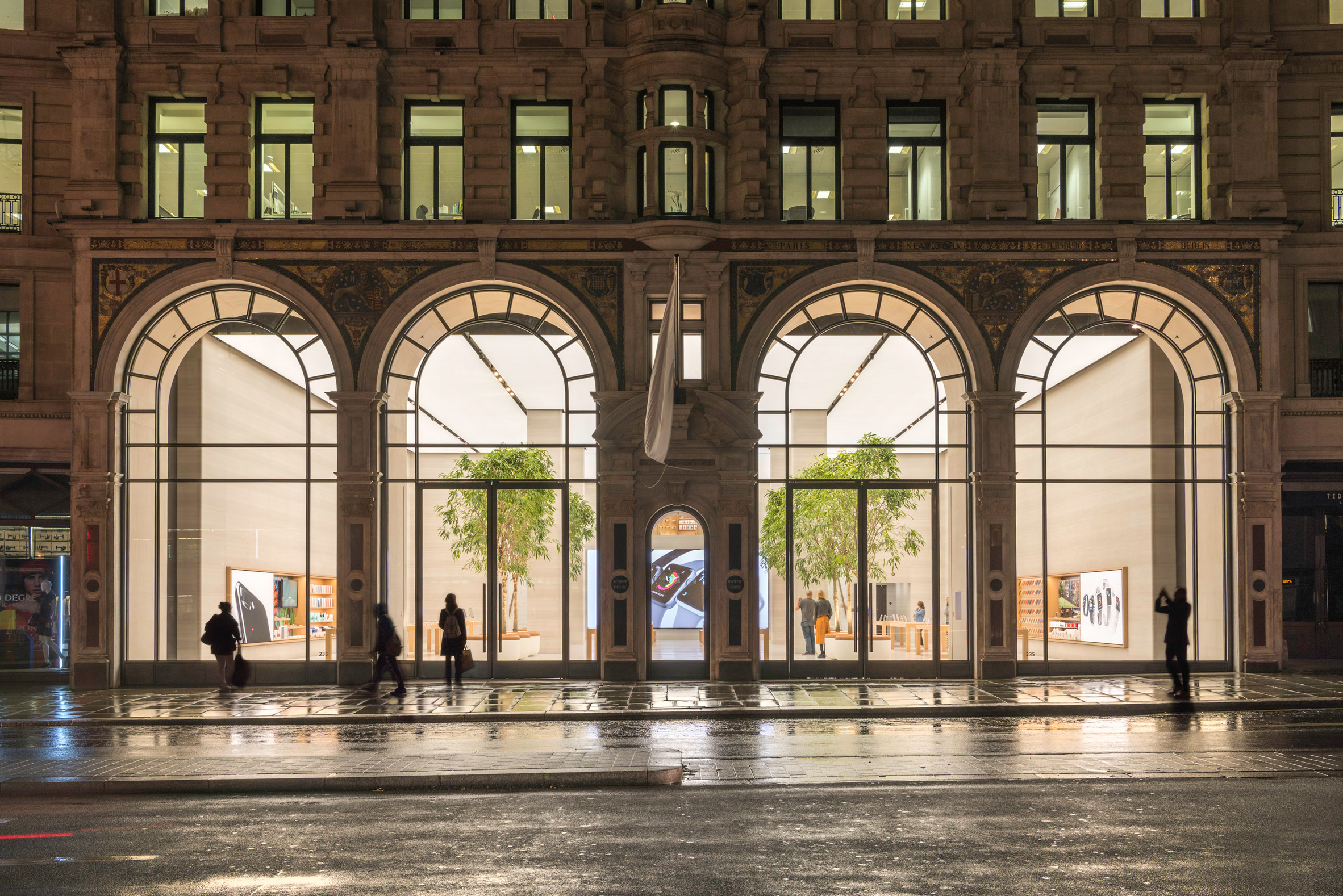
Set behind a Grade II-listed exterior facade on London’s busy Regent Street, the store has been opened up through the removal of an an atrium level around the edge of the store.
“Regent Street looked quite different when we opened in 2004,” said the company. “Apple is respectful of the city’s tremendous culture and history, which we hope you see reflected in the building today.”
“All the materials are sympathetic to the historic nature of the building,” it added.
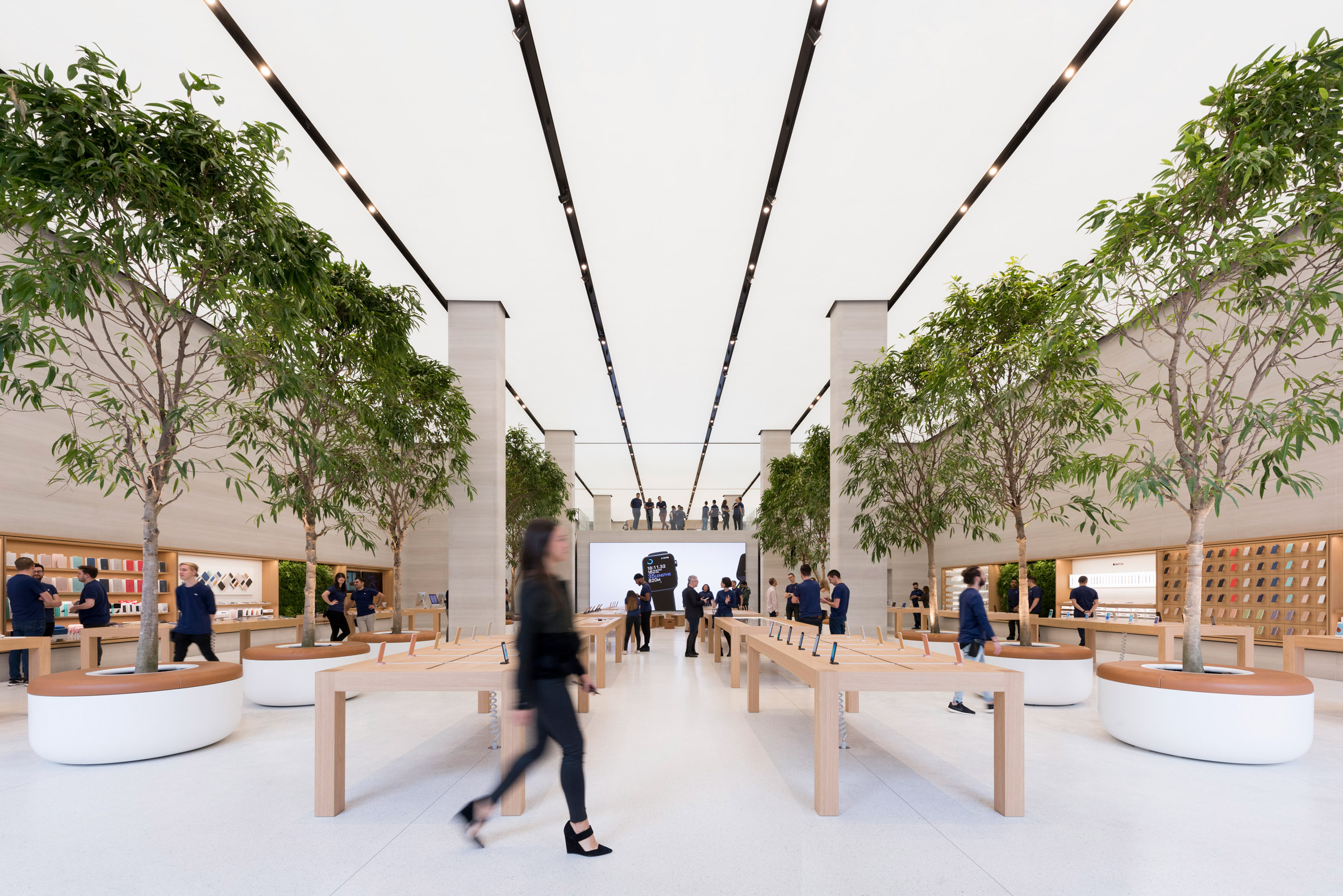
The chosen palette of materials include a white terrazzo floor, Castagna stone walls, bronze metal accents and oak timber for the fittings and fixtures. Light boxes extend the length of the ceiling.
Inside, the store is split into three areas named the Avenue, Boardroom and Forum.
These areas also feature inside the Foster + Partners-designed San Francisco store, which was intended to serve as a model for future Apple outlets around the world when it opened earlier this year.
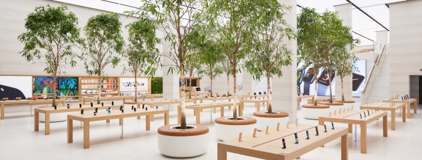
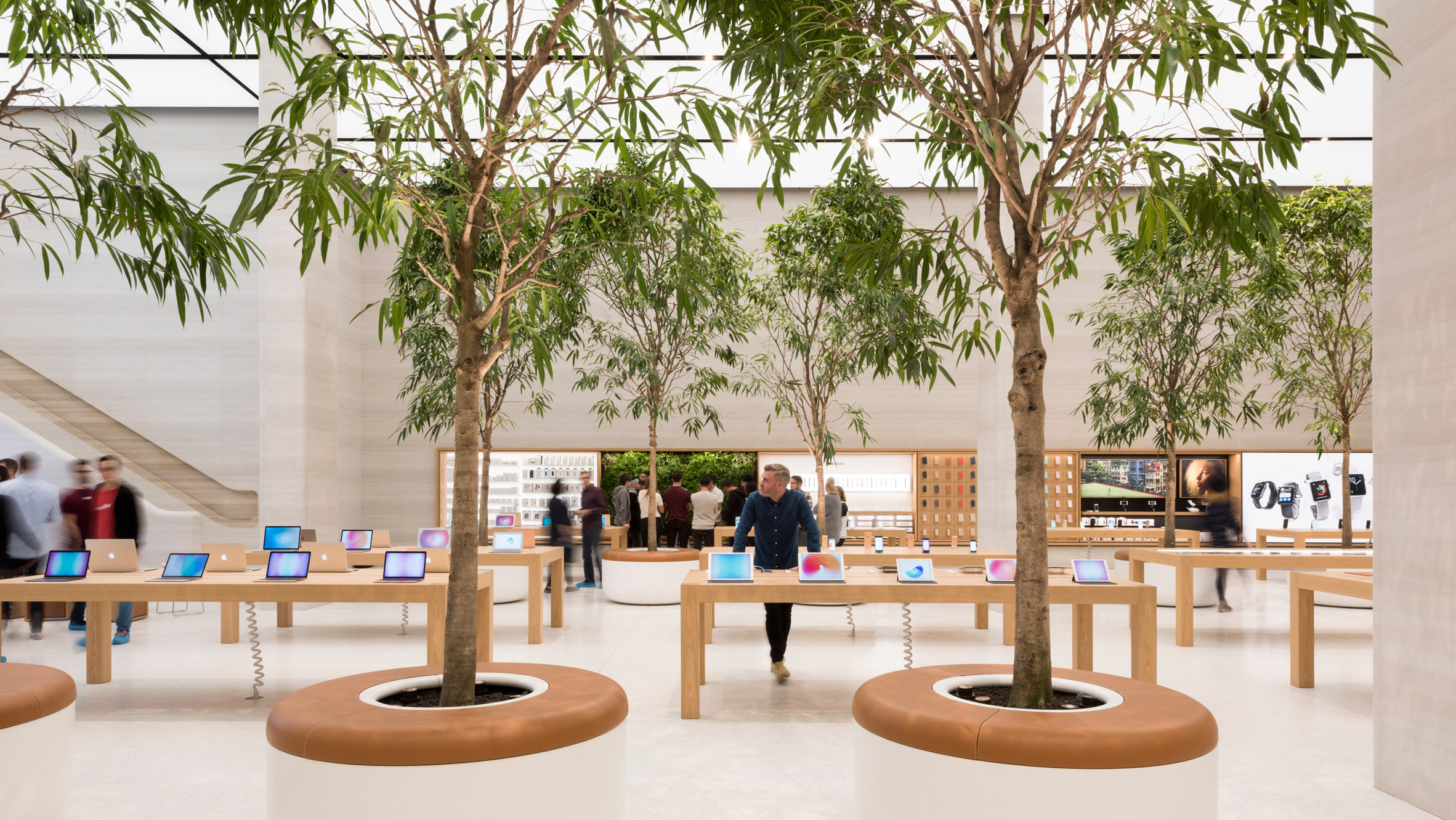
On the Avenue, tree-filled planters created by Foster + Partners and Apple’s industrial design team double up as seating.
Apple’s products and services are displayed inside interactive themed windows, and “creative pros” – Apple’s experts for the creative industries – are on hand to offer advice at each of the displays.
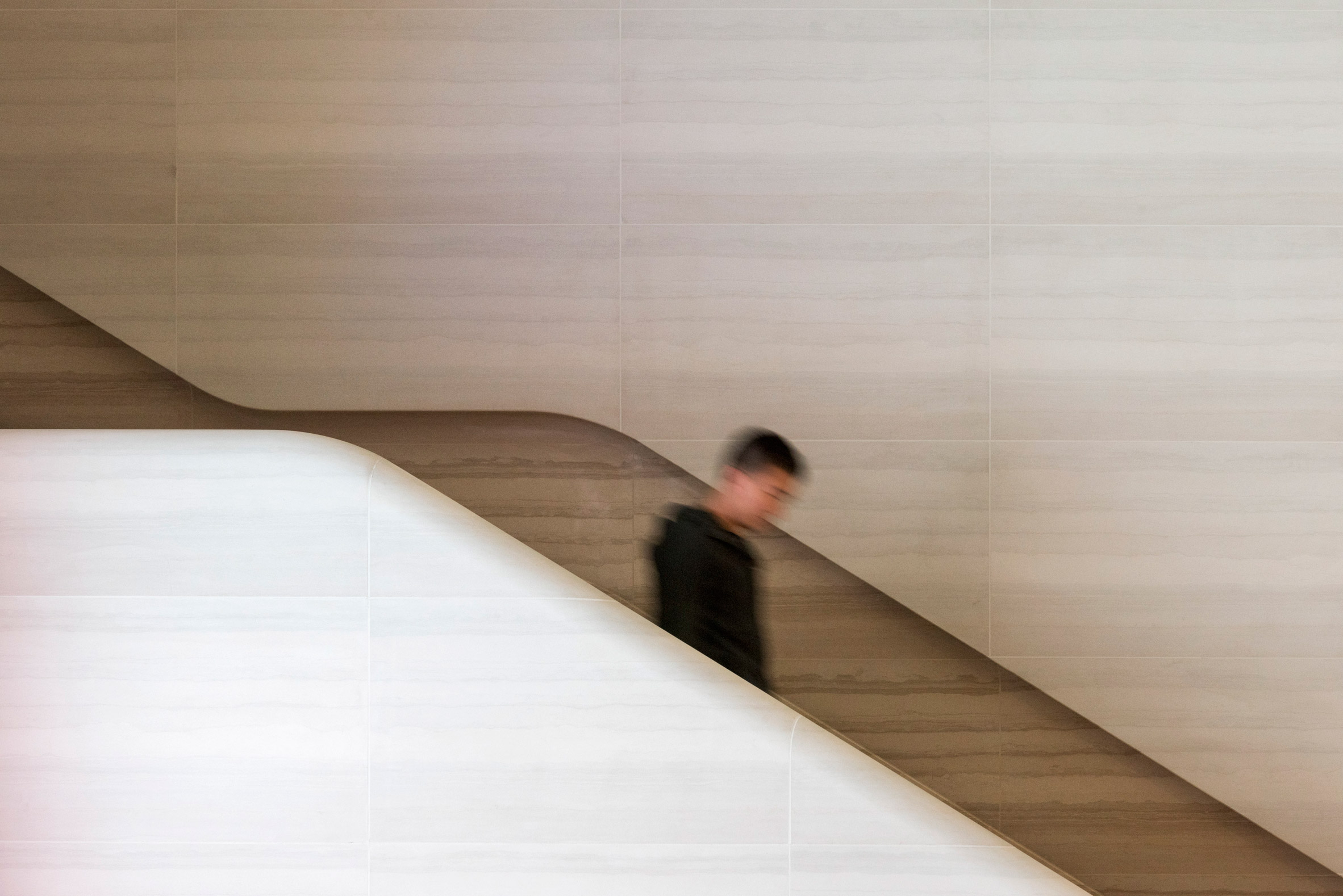
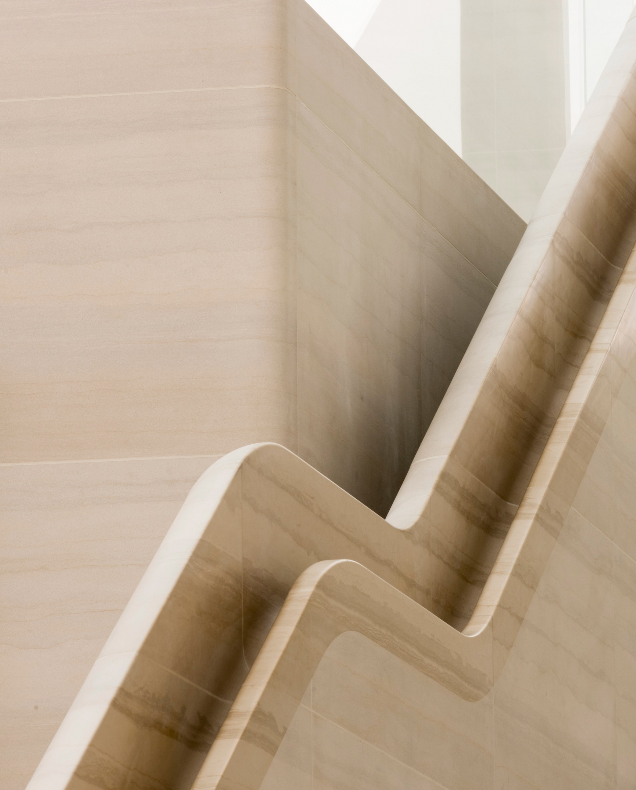
Towards the back of the store, twin staircases made from sandblasted Castagna stone lead visitors up to the new mezzanine level.
Between the two staircases is The Forum, which provides a gathering place for events. Here, groups of box-shaped stools are set in front of a gigantic video wall that will play exclusive premieres of new music and videos.
The Boardroom is a more intimate space where the store’s business team are able to offer advice and training to entrepreneurs, developers and other small-to-medium business customers.
The shakeup of the brand’s retail approach follows criticism from retail designer Tim Kobe, who worked on the first Apple Stores.
Speaking to Dezeen in 2013, Kobe said that the evolution of Apple’s retail approach was “not happening as fast as it could be”.
In 2013, Apple trademarked the “distinctive” interior design of its then 400 stores worldwide. The company was recently honoured with a preservation award for sensitively repurposing historic buildings.
Foster + Partners has overseen the design of several Apple Stores worldwide, including branches in Istanbul and Hangzhou.
The firm, led by architect Norman Foster, is also working on the vast Apple Campus 2 in Cupertino.
RECHI Focuses On Custom Designing & Manufacturing Retail Mobile Phone Shop Displays And Store Fixtures
For more about us and our new retail solutions,find us at at RECHI Retail

